
Photo by Aris Munandar on Unsplash
The Best Approach to Website Responsiveness (Stop Abusing Media Queries)
Make writing responsive code easier by making smart decisions
If you're familiar with the concept of responsive web design, you would have inevitably made use of media queries.
However, without the right approach, media queries can easily be abused.
Beyond understanding media queries for responsive design, approaching the entire development process with responsiveness in mind is crucial.
A lot of times, simply writing better code with certain principles in mind will drastically reduce the need for media queries.
We'll go through three concepts, which when applied properly, will make responsive design a smoother process for you.
Relative vs. Absolute Units
Absolute units (px in particular, because the others are rarely used) in CSS have their place, but can easily be abused.
From a responsive design standpoint, the px unit does not adapt well to varying screen sizes and should be avoided most of the time.
Width and Height
Say you set a 450px width on an element on your page. What if the width of the page goes below 450px? Where does the extra width go? It overflows, of course, and we DO NOT want that.

Here, the element is on a 1200px-wide screen and is fully visible.

However, if the screen size is reduced to 320px, the 450px-wide element overflows the screen.
Setting a relative width, however (in % or vw), means it will be computed dynamically depending on the dimensions of the parent or viewport, promoting responsiveness.
Let's talk about heights now.
It is HIGHLY RECOMMENDED to leave the heights of containers unset.
This is because the items contained in an element could take up different amounts of vertical space depending on the size of the screen.
Constraining the height of the container to whatever value could create a vertical overflow when the items wrap downwards, or when more content is added.
Let's take a header with some content as follows:
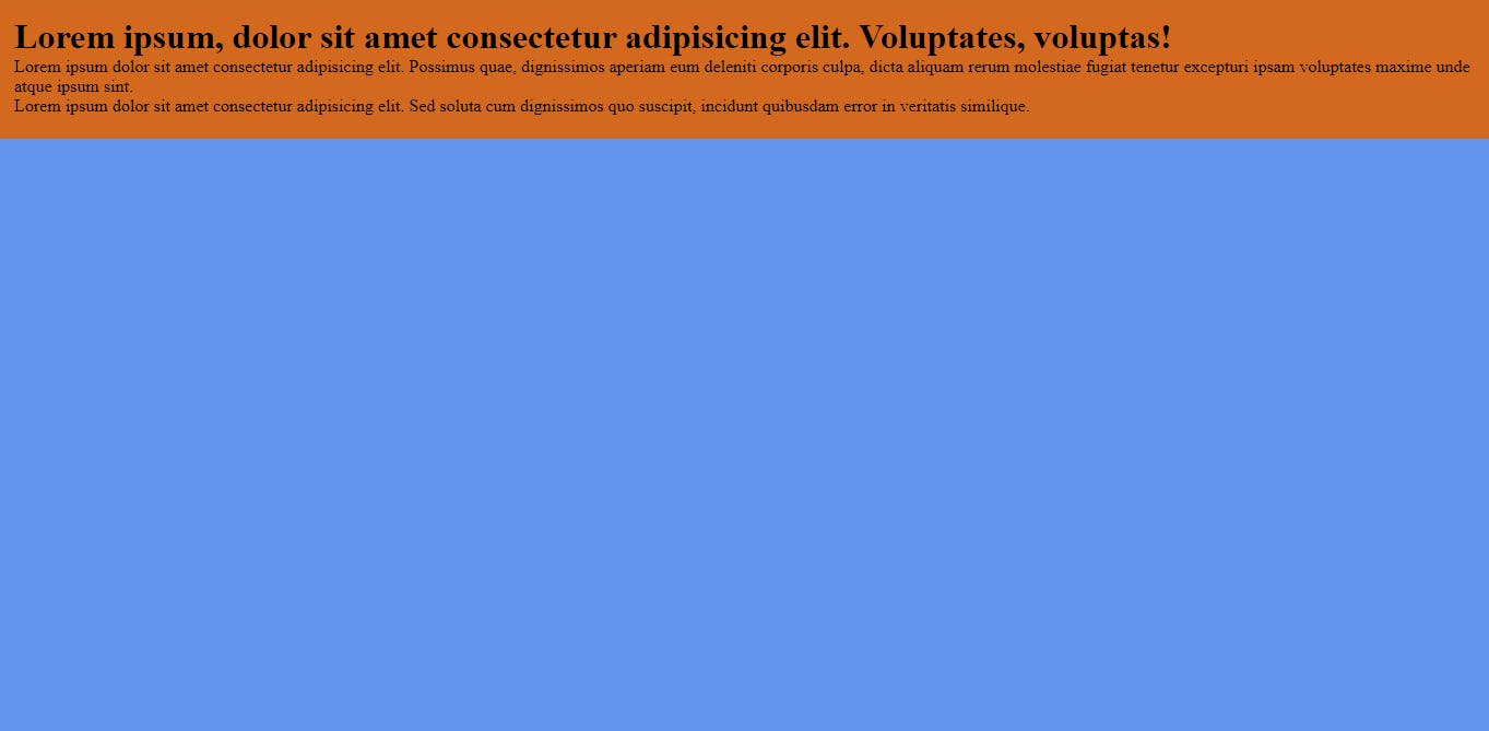
The header has been given some padding, as well as a brown background.
The height of the header has also been specified at 8rem. It looks fine now.
However, when we reduce the width of the screen, the text overflows the header because its height has been fixed at 15rem. The header can no longer increase in size to accommodate more content.
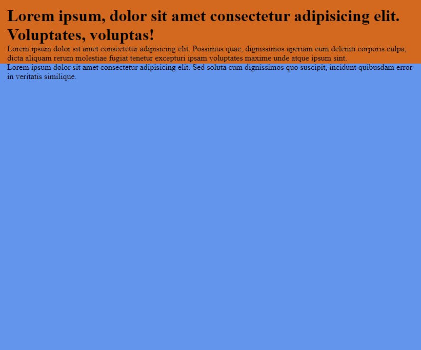
I usually see people set a fixed height and use media queries to increase the height at breakpoints where the content overflows. Highly unnecessary.
In essence, for widths, use relative units such as % , and vw, and do not set fixed heights.
Padding and Margin
Paddings and margins should be defined using relative units as well. Avoid using px to define paddings and margins.
I like to use rem for smaller paddings (such as between elements), and % for larger paddings (between and around entire sections or the whole page) that affect the page layout.
Let's go back to our header.
We've removed the fixed height and now we have given it a large 5rem margin all around.
header {
  margin: 5rem;
}
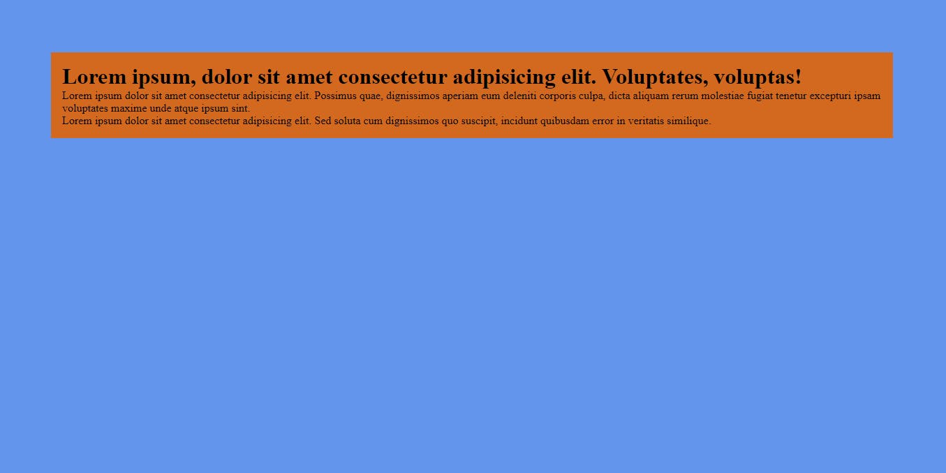
It looks okay on desktop, but as we move to smaller screens, it starts to become increasingly cramped.
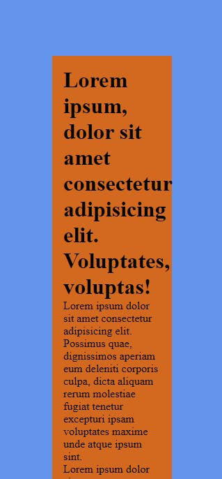
5rem on a small screen takes on much more space than on a large screen.
What if we used % instead?
header {
  margin: 5%;
}
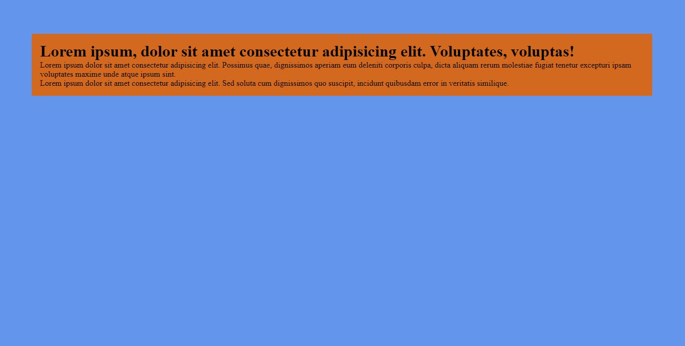
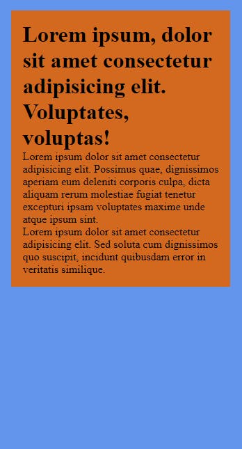
As you can see, using % for the margin allowed it to be dynamically computed based on the width of the container (the document body in this case).
The same thought process applies to padding.
Font Size
Stop using px for font sizes. You read that right.
Stopeet!
Why though?
Font sizes specified in pixels are fixed and do not scale with the user's preferences or device characteristics.
What is 48px on a desktop screen will be 48px on a phone screen, and will remain 48px whether or not the user changes their browser's default font size.
Use relative units like em and rem instead. This way, the text will adapt to changes in user preferences, as well as scale depending on the viewport.
Often, when defining layout properties like width, height, margins, and padding, relative units such as percentages and viewport units are much preferred. They allow elements to adapt to different screen sizes.
So, whenever you think of using
px, stop and think:"Would a relative unit achieve a better result and potentially allow me to reduce or eliminate the need for media queries?"
Most of the time, the answer to this question would be YES.
CSS Flexbox and Grid
Besides using more relative units, make sure to take advantage of the powers of CSS Flexbox and Grid.
The flex-wrap property allows flex items to wrap to the next line when the viewport becomes too small to contain all the items on one line.
.flex-container {
  display: flex;
  flex-wrap: wrap;
}
Also, grid auto-place properties, when combined with the option to repeat-to-fill columns, become a powerful tool to achieve automatically responsive layouts without the need for media queries.
.grid-container {
  display: grid;
  grid-template-columns: repeat(auto-fit, minmax(15rem, 1fr));
}
More about grid auto-sizing columns here.
CSS clamp()
Finally, we'll look at a feature that you probably don't already know about:
The clamp() function.
CSS clamp() helps you set a value within a specified range. It ensures that a property, such as font size or element width, will never go below a minimum value or exceed a maximum value, while also allowing it to adapt within that range based on the available space.
In simpler terms, clamp() lets you say:
"Make this value at least this big."
"But don't let it get bigger than this."
"And if there's extra space, adapt within that range."
For example, you can use clamp() to set a font size like this:
font-size: clamp(16px, 4vw, 36px);
The minimum font size is 16 pixels.
The maximum font size is 36 pixels.
But, if there's a lot of space (e.g., on a large screen), it will adjust between 4% of the viewport width (4vw) and 36 pixels, creating a responsive and readable font size.
Parting Words
That's it!
Hopefully, you now understand the power that lies in making intentional decisions when building responsive websites.
If done right, you will end up not having to use media queries so many times.
Have a good one! (^_^)
P.S.
Don't forget to like this post, leave a comment, share, and engage with my other posts.
Thank you.
